
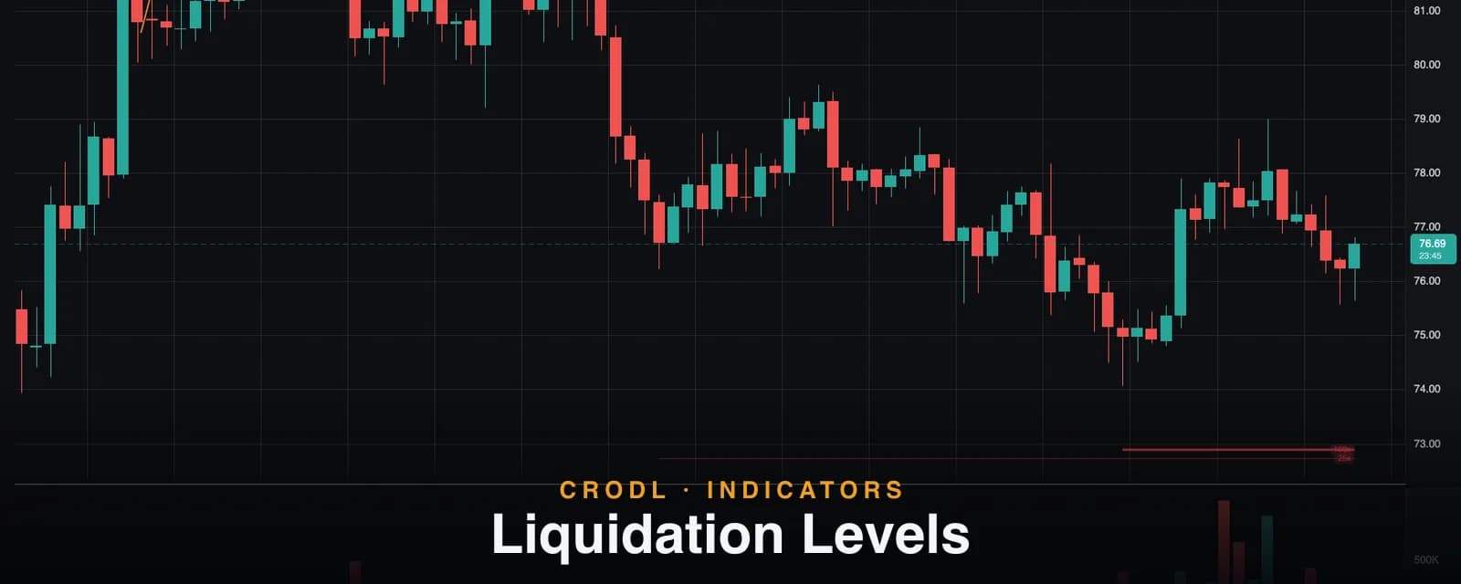
Liquidation Levels: How to Read Liquidation Magnets on a Crypto Chart
Leveraged positions cluster at obvious swing points, and their liquidation prices become magnets. How Crodl estimates those zones, reads the 10x-100x tiers, and trades them.
Crypto is the most leveraged market in the world. Every swing low and swing high on your chart is a place where traders piled into positions — and every one of those positions carries a liquidation price. When enough of them stack up around the same level, that level stops being a statistic and starts acting like a magnet.
The Liquidation Levels indicator on the Crodl terminal draws those magnets directly on your chart: estimated liquidation zones for 10x, 25x, 50x, and 100x positions entered at recent swing points. This post explains how the estimate works, how to read it, and the practical ways traders use it.
Why liquidations move price
When a leveraged long is liquidated, the exchange force-sells the position into the market. One liquidation is noise. Hundreds of liquidations clustered at the same price are forced, price-insensitive selling — which is why price often accelerates into dense liquidation zones and reverses once they are cleared.
That produces two patterns you have probably watched happen:
- Liquidity runs — price wicks below an obvious swing low, wipes out the leveraged longs parked under it, and immediately reverses. The move existed because the liquidations were there.
- Cascade fuel — in a trending move, each cleared liquidation cluster adds forced volume in the direction of the trend, extending it to the next cluster.
If you know where those clusters sit, you stop being the trader who gets wicked out and start being the trader who expects the wick.
How the indicator estimates liquidation levels
The indicator does not read exchange liquidation feeds. It uses market structure — where leveraged traders demonstrably enter — and derives where their liquidations must sit:
- Find significant swings. A confirmed swing low is where dip-buyers entered longs; a confirmed swing high is where breakout-shorts entered. Swing strength is configurable, so you control how major a pivot must be to count.
- Project the liquidation prices. A long entered at price
Ewith leverageLliquidates nearE × (1 − 1/L). A 100x long entered at a swing low of $80 liquidates around $79.20; a 10x long around $72. Shorts mirror above swing highs. - Draw the tiers. Each swing projects four levels — 10x, 25x, 50x, and 100x. Higher leverage sits closest to the entry and is drawn hottest and boldest, because it is both the most crowded and the first to go.
- Consume swept levels. Once price trades through a level, those positions are gone — the level is removed (or shown dimmed, if you enable Show swept levels). What remains on your chart is only the liquidity that is still alive.
| Tier | Distance from entry | Typical role |
|---|---|---|
| 100x | ~1% | First magnet — swept by ordinary volatility |
| 50x | ~2% | Intraday wick targets |
| 25x | ~4% | Swing-level stop runs |
| 10x | ~10% | Deep flush / capitulation zones |
Long liquidations are drawn below swing lows in red — price falling into them adds sell pressure. Short liquidations sit above swing highs in teal — price rising into them adds forced buying, which is fuel for continuation.
How traders actually use it
Targets on the other side of the book
The cleanest use: when you are long, the short-liquidation cluster overhead is a natural take-profit zone — price is drawn toward it, and once it is swept the forced buying that got you there is spent. Crodl's TP/SL lines can be dragged directly onto these levels from the trade ticket.
Stops beyond the cluster, not inside it
If your stop sits inside a dense 50x–100x band under a swing low, you are volunteering to be part of the liquidity run. Placing stops beyond the cluster — after the magnet, not before it — keeps you out of the wick that exists specifically to collect that pocket.
Confluence with structure
Liquidation zones that overlap a Visible S/R level or a volume-profile shelf are meaningfully stronger than either signal alone. A swing low with a fat 25x band right under a high-volume node is the kind of level markets respect — or run once, violently, before respecting.
Settings that matter
- Swing length — how major a pivot must be to seed levels. Larger = fewer, more significant clusters.
- Swings per side — how many recent swing entries stay on the chart (default 3 per side).
- Tier toggles — hide the tiers you do not trade around; scalpers often keep only 50x/100x, swing traders 10x/25x.
- Show swept levels — display already-consumed levels dimmed, useful for reviewing how price interacted with past clusters.
An honest note on accuracy
This is an estimate built from market structure, not exchange liquidation data. It assumes traders enter at swings (they demonstrably cluster there), and it deliberately ignores maintenance margin and fees, which pull real liquidation prices slightly closer to entry than the simple formula. Treat the zones as areas, not lines — the value is knowing where the crowd is vulnerable, not predicting a print to the cent.
Frequently Asked Questions
Is this the same as a liquidation heatmap?
Same idea, different source. Heatmap products infer clusters from open-interest and exchange data; this indicator derives them from price structure on the chart in front of you. It works on any symbol and timeframe, updates instantly with the chart, and requires no external data. If you want the full heatmap-style view — density at every price level rather than lines from the latest swings — pair it with Liquidation Bands.
Does it repaint?
A swing pivot needs swing length bars on both sides to confirm, so a brand-new pivot appears only after confirmation — standard for any pivot-based tool. Once a level is drawn, it never moves; it only gets consumed when price sweeps it.
Which timeframes does it work on?
All of them. On low timeframes the 50x/100x tiers dominate (they are within intraday reach); on higher timeframes the 10x/25x tiers mark the deep flush zones that define swing structure.
Why did a level disappear?
Price traded through it — those positions were liquidated, so the magnet no longer exists. Enable Show swept levels if you want consumed zones kept on the chart, dimmed.
Trade with the magnets, not against them
Liquidation Levels is available on every Crodl terminal chart — add it from the indicator picker, drop it on your pair, and the map of leveraged vulnerability is on your chart in one click, alongside live trading on six exchanges.
This article is for educational purposes only and is not financial advice. Leveraged trading carries substantial risk of loss. Always do your own research and never risk more than you can afford to lose.

Ready to automate your trading?
Connect your exchange, set up automations, and start trading smarter — all from one platform.
Start Trading Free