
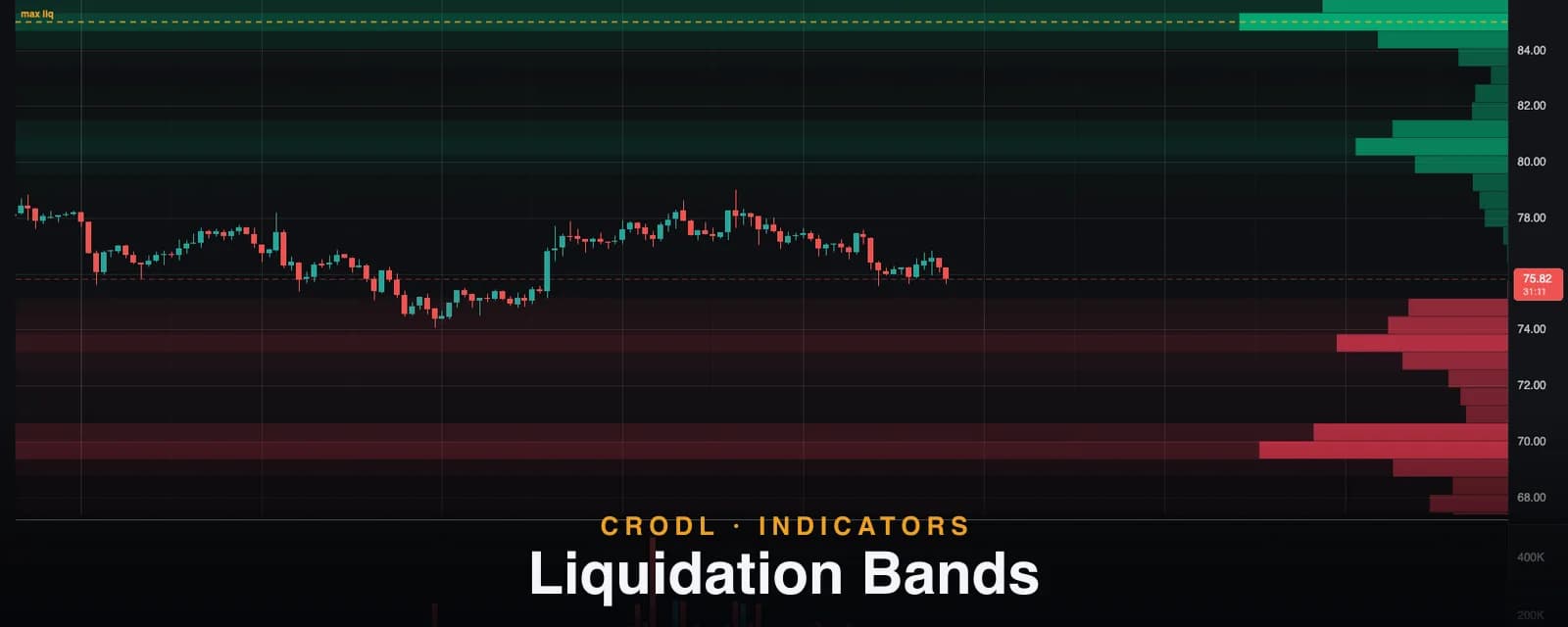
Liquidation Bands: A Heatmap of Where Leverage Dies
A heatmap-style view of estimated liquidation density at every price level — how the bands are built, why they burn off when swept, and how to trade the map.
The Liquidation Levels indicator answers a sharp question: where would positions from the most recent swings get liquidated? Liquidation Bands answers the broader one: across every price level on the chart, how much estimated liquidation liquidity is still alive right now?
The result looks like the liquidation heatmaps traders pay for elsewhere — horizontal bands of intensity across the whole chart, brightening where leveraged positions cluster — except it is estimated live from the chart's own structure and volume, on any symbol and timeframe, with nothing to configure before it is useful.
What it shows
Three layers, all driven by one density model:
- Heat bands — full-width horizontal tints. The brighter the band, the more estimated liquidation liquidity is parked at that price. Rose bands sit below entries (long liquidations — downside magnets); teal bands sit above (short liquidations — upside fuel).
- Density profile — a compact histogram along the right edge showing the same mass as magnitude, so you can compare levels at a glance.
- Max liq line — a dashed amber line at the single densest surviving level: the current "max pain" price the market has the most incentive to visit.
How the density model works
Every bar on the chart is treated as an entry cluster — its volume proxies the positions opened there, at its typical price. Each cluster's liquidations land at fixed leverage-tier offsets: a 100x long entered at $80 liquidates near $79.20, a 10x long near $72, with shorts mirrored above. Four tiers (10x/25x/50x/100x) are weighted by a fixed retail leverage mix — lower leverage carries more of the open interest, higher leverage sits closer to the entry and pops first.
The mechanic that makes the map honest is consumption. The indicator walks the chart forward and, for every bar:
- Burns off any liquidation mass at prices the bar traded through — price visited that level, so whatever was parked there has already fired.
- Deposits the bar's own estimated positions at their tier offsets.
What survives to your screen is exactly the liquidity that price has not yet collected — deposited after the last time that level was touched. A level that was swept yesterday shows nothing today unless new positions have rebuilt it.
| Layer | What it tells you |
|---|---|
| Bright band below price | Dense long liquidations — a downside magnet and acceleration zone |
| Bright band above price | Dense short liquidations — fuel for an upside squeeze |
| Max liq line | The single most crowded surviving level on the chart |
| Fading bands after a wick | That liquidity was just collected — the magnet is spent |
How traders use it
Read the asymmetry
The single most useful glance: is there more surviving mass above or below? A chart with heavy teal overhead and thin rose below leans toward an upward liquidity run — the forced buying lives above. When the map is stacked the other way, rallies tend to stall and dips extend.
Anticipate the wick, then the reversal
Price is drawn toward dense bands, and once a band is swept the forced flow that created the move is spent. The classic pattern — a fast probe into a bright band followed by reversal — is the same liquidity-run behavior Liquidation Levels trades at specific lines, seen here as a landscape.
Confluence with structure
A bright band that overlaps a Visible S/R zone or a high-volume node on the Volume Profile is a level the market genuinely cares about. The band explains why the level acts as a magnet; the structure explains why it may hold afterward.
Settings that matter
- Price bins (default 60) — vertical resolution of the density map.
- Lookback (default 1,000 bars) — how much history feeds the model. Longer = a fuller landscape; shorter = only recent positioning.
- Tier toggles — drop tiers you do not care about; disabling 10x also narrows the price range the map covers (its offsets reach furthest).
- Band threshold (default 10% of max) — hides sparse bands so only meaningful density tints the chart.
- Heat bands / density profile / max-liq line — each layer toggles independently.
An honest note on the model
Like its sibling, this is an estimate from market structure, not exchange liquidation data. It assumes every bar's volume opened positions at that bar's typical price, splits them 50/50 long/short (taker direction is unknowable from candles), applies a fixed leverage mix, and ignores maintenance margin and fees — real liquidations sit slightly inside the tier offsets. Treat the bands as a relative density map: where is liquidity thick versus thin — not a literal order book.
Frequently Asked Questions
How is this different from Liquidation Levels?
Same physics, different lens. Levels draws precise, tradeable lines from the most recent swing entries — best for placing targets and stops. Bands aggregates every bar into a density landscape — best for reading which side of the market is crowded and where the big magnets sit. They pair well on the same chart.
Why did a bright band suddenly disappear?
Price traded through it. Consumption is the core mechanic: once a level is visited, the positions parked there are liquidated and their mass is removed. Only fresh positioning rebuilds a band.
Is this real liquidation data like the paid heatmaps?
No — heatmap products infer clusters from exchange open-interest data; this estimates them from price structure and volume on the chart in front of you. The trade-off: it works instantly on any symbol and timeframe with no external feed, but it is a model of crowd behavior, not a measurement.
Which timeframes work best?
Any, but the map is most readable where there is enough history for the lookback to chew on — 15m to 4h are the sweet spot. Higher timeframes produce broader, slower-moving bands; lower ones react faster and burn off more often.
See the whole battlefield
Liquidation Bands is live on every Crodl terminal chart — add it from the indicator picker, pair it with Liquidation Levels, and the leverage landscape is on your chart in one click.
This article is for educational purposes only and is not financial advice. Leveraged trading carries substantial risk of loss. Always do your own research and never risk more than you can afford to lose.

Ready to automate your trading?
Connect your exchange, set up automations, and start trading smarter — all from one platform.
Start Trading Free