
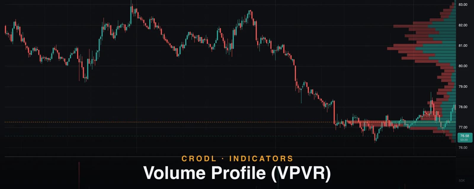
Volume Profile (VPVR)
See where crypto volume actually traded: Crodl's visible-range Volume Profile maps POC, value area, and up/down volume live as you pan and zoom the chart.
A candlestick chart tells you where price went. It does not tell you where the market actually did business — the prices where real volume changed hands, positions were built, and both sides agreed to trade size. That information lives on the horizontal axis, not the vertical one, and most traders never look at it.
The Volume Profile (VPVR) indicator on the Crodl terminal draws that horizontal map: a histogram of traded volume at each price level, built from the candles currently on your screen, split into up and down volume, with the Point of Control and the 70% value area highlighted automatically. VPVR stands for Volume Profile Visible Range — the profile rebuilds from whatever your viewport shows, so the map always matches the structure you are actually analyzing.
This post covers what the profile shows, exactly how Crodl computes it, and three ways traders put it to work.
What a volume profile shows — and why it matters
The volume bars under your chart answer when volume traded. A volume profile answers at what price — which is the question that matters for support and resistance. Price levels with heavy traded volume are acceptance: both sides did business there, inventory is anchored there, and price tends to slow down and react when it comes back. Levels with thin volume are rejection: the market moved through quickly, nobody built positions, and price tends to move through them quickly again.
Three structures fall out of that idea. The Point of Control (POC) is the single price row with the most traded volume — the fairest price of the visible range and its strongest magnet. The value area is the band around the POC containing 70% of all traded volume — the zone the market considers "fair". Everything else is a landscape of high-volume nodes (shelves that slow price down) and low-volume nodes (thin zones price traverses fast).
How VPVR works on the Crodl terminal
Add Volume Profile from the indicator picker and the histogram appears pinned to the right edge of the price pane, scaled so the widest row takes up to about a quarter of the pane — candles stay readable underneath it. Under the hood:
- Bucket the visible range. The high–low span of every candle in view is divided into price rows — the Row size input, default 48 rows (adjustable from 8 to 120).
- Distribute each candle's volume. A candle's volume is spread across every row its high–low range overlaps, proportionally to the overlap. This is the standard profile approximation when per-trade data is not available.
- Split by direction. Candles closing at or above their open count as up volume, drawn against the right edge; down volume extends further left. Each row shows both how much traded and which side was in control.
- Mark the POC and value area. The densest row gets a dashed POC line drawn across the whole pane. A greedy walk from the POC absorbs whichever adjacent row carries more volume until 70% of total volume is covered — those rows render brighter, and the POC row brightest of all.
Because the profile is visible-range, it recomputes whenever the view changes: pan, zoom, or a live tick updating the forming candle's volume. Scroll back to last month and you get last month's profile. That is the point — the profile always describes the exact structure in front of you.
Settings are deliberately lean: Row size for resolution, plus Up volume, Down volume, and POC line colors under Style. The value area fraction is fixed at the industry-standard 70%. If you want per-session or per-candle profiles with a configurable value area, that is the Periodic Volume Profile.
Reading the profile
| Structure | What it is | How price tends to behave there |
|---|---|---|
| POC | The highest-volume price row | Strongest magnet; frequent retest and rotation target |
| Value area | 70% of volume around the POC | Rotation inside; acceptance or rejection at the edges |
| High-volume node | A local bulge in the profile | Sticky — price slows, consolidates, reacts |
| Low-volume node | A thin shelf between nodes | Fast traverse — weak support, weak resistance |
How traders actually use it
Fade the edges back to the POC
Inside a balanced, bell-shaped profile, the value area edges are the range boundaries. A push to the top of the value area that stalls is a candidate short back toward the POC — the market probing above fair value, finding no business, and rotating home. The same logic mirrors at the bottom edge.
Trade the low-volume traverse
Breakouts accelerate through thin profile zones because there is no anchored inventory to slow them down. When price breaks a high-volume shelf and enters a low-volume node, the next high-volume node is the natural target. This pairs well with the Visible S/R indicator — a thin zone between two mapped levels is a runway.
Acceptance outside value
When price leaves the value area and holds there — building new volume instead of snapping back — the market is repricing. Old POCs flip from magnet to support. Trend traders use this as a continuation filter, often alongside VWAP: acceptance above both the value area high and VWAP is a strong trend signal.
An honest note on accuracy
VPVR is built from OHLCV candles, not tick data. Distributing a candle's volume proportionally across its range is the standard approximation — good, but an approximation. Zooming in helps: lower-timeframe candles have tighter ranges, so the profile sharpens as you drill down. The up/down split is also per-candle direction, not per-trade aggressor data — treat it as a bias read, not delta.
Frequently Asked Questions
Why does the profile change when I scroll?
Because it is a visible range profile — it aggregates exactly the candles on screen. That is deliberate: the profile always describes the structure you are trading, not some fixed lookback. For profiles anchored to fixed periods (day, week, per candle), use the Periodic Volume Profile instead.
Is the up/down split real buy and sell volume?
No — it splits by candle direction (close at or above open = up). True buy/sell delta requires per-trade aggressor data. The split is still useful as a directional bias at each price level.
How is VPVR different from the TPO Profile?
VPVR weights price levels by traded volume; the TPO Profile weights them by time spent at each level and groups by day, week, or month. Both find acceptance zones, and their POCs frequently — but not always — agree. Divergence between them is information.
Does it update on live ticks?
Yes. The forming candle's volume, high, and low feed into the profile as they update, so the POC and value area can shift intra-bar on the row where trading is happening right now.
Put the volume map on your chart
Volume Profile is one click away on every Crodl terminal chart — add it from the indicator picker and every pan and zoom gives you a fresh map of where the market did business, alongside live trading on six exchanges.
This article is for educational purposes only and is not financial advice. Leveraged trading carries substantial risk of loss. Always do your own research and never risk more than you can afford to lose.

Ready to automate your trading?
Connect your exchange, set up automations, and start trading smarter — all from one platform.
Start Trading Free