
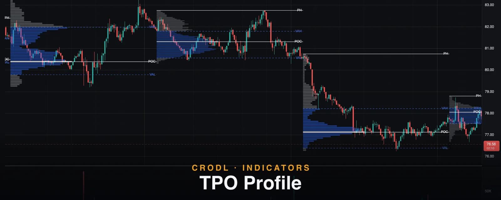
TPO Profile
Read crypto markets like a floor trader: Crodl's TPO Profile builds daily, weekly, or monthly time-at-price profiles with POC, VAH, and VAL on any chart.
Market Profile was invented on the Chicago futures floor in the 1980s to answer a deceptively simple question: at which prices is the market actually spending time? Not where it wicked to, not where it printed a single trade — where it kept coming back, over and over, within a session. Those prices are where the auction found balance, and they behave like gravity long after the session ends.
The TPO Profile on the Crodl terminal is that tool, rebuilt for crypto's 24/7 auction. It groups your chart into daily, weekly, or monthly sessions and stacks a Time Price Opportunity (TPO) count at every price level each session touched — then marks the session's Point of Control, value area high and low, and period high directly on the chart.
Where a volume profile weights prices by traded volume, TPO weights them by time. Both measure acceptance; when they disagree, you have learned something about the session.
What a TPO profile shows
Each candle in a session contributes exactly one TPO to every price row its high–low range touches. Volume is not used at all — a fat row means the market revisited that price across many bars, not that it traded size there. Stack the counts and the session's shape appears:
- A wide, symmetric profile is a balanced auction — the market rotated around a fair price all session.
- A thin, elongated profile is an imbalanced auction — price kept moving in search of a fair level and never found one.
From the shape, the indicator derives the levels floor traders actually quote: the POC (the row with the most TPOs — the session's fairest price), the value area (the contiguous band around the POC covering 70% of all TPOs by default), and its boundaries VAH and VAL.
How it works on the Crodl terminal
Add TPO from the indicator picker. The chart is segmented into UTC sessions using the Period setting — Daily (the default), Weekly (weeks start Monday UTC), or Monthly. For each session:
- The session's full price range is split into rows — the Row size input, default 64 rows (8 to 160).
- Every candle in the session adds one TPO to each row its range touches.
- The profile is drawn from the session's first bar, scaled to the session's width on screen, with value-area rows tinted and the POC row highlighted.
- Four levels are drawn across the session with labels: PH (period high), POC (solid), and VAH / VAL (dashed).
The current session updates live as the forming candle grows, and the value area is configurable: Value area % sets the fraction of TPOs the value area must cover, default 0.70, adjustable from 0.50 to 0.90.
The settings you will actually touch: Period and Row size for structure, Value area % for the band width, Show profile and Show labels toggles (both on by default), plus Style colors for the profile, value area, POC, PH level, and VA levels, and a Line width control (default 1.2).
| Level | Label on chart | What it marks |
|---|---|---|
| Period high | PH | The session's highest traded price |
| Point of Control | POC | The price row with the most TPOs — the session's fairest price |
| Value area high | VAH | Upper boundary of the 70% acceptance band |
| Value area low | VAL | Lower boundary of the 70% acceptance band |
How traders actually use it
Open outside value, rotate to the POC
When a new session opens outside the previous session's value area and then trades back inside it, the classic play is rotation across the value area toward the old POC. The market rejected the open as unfair and is auctioning back to yesterday's accepted prices. The prior session's VAH/VAL lines give you the trigger and the POC gives you the target.
Revisit the untested POC
A POC that price never revisited after the session ended — a "naked" POC — is unfinished business. Markets have a strong tendency to return to these levels days or weeks later. Flip to Weekly or Monthly period and old POCs become a map of magnet levels for swing targets, stacking well with liquidation clusters when both point at the same price.
Read the shape before you fade
A fat, symmetric profile says balance — fading moves at VAH/VAL back toward the POC is playing the rotation. A thin, elongated profile says trend — the same fade is stepping in front of an auction still searching for value. Checking the shape of the current session before taking a mean-reversion trade is the cheapest filter TPO gives you.
An honest note on sessions
Sessions are grouped by UTC calendar boundaries — days roll at 00:00 UTC, weeks start Monday UTC. That is the natural convention for crypto's continuous market, but it means profiles will not line up with a specific exchange's futures session or your local midnight. TPO counts are also built from your current chart timeframe's candles: lower-timeframe candles produce finer time resolution within each session.
Frequently Asked Questions
Is TPO the same as a volume profile?
No. TPO counts time at price (one count per candle per touched row); a volume profile distributes traded volume across prices. A price can hold lots of time with little volume and vice versa. When the TPO POC and volume POC agree, that level is doubly significant.
Does the current session update in real time?
Yes — the forming session's profile, POC, and value area update live as candles grow, and completed sessions never change.
Can I widen or narrow the value area?
Yes. Value area % accepts anything from 0.50 to 0.90 (default 0.70). A wider band highlights only extreme excursions from value; a narrower one tightens the rotation zone.
Which timeframe should my chart be on?
Any — the grouping is by calendar period, not chart resolution. For daily profiles, 5m–30m charts give well-resolved shapes; for weekly and monthly profiles, 1h–4h charts keep sessions readable. Per-candle and intraday-period profiles are the Periodic Volume Profile's job.
Trade the auction, not the noise
The TPO Profile is available on every Crodl terminal chart — add it from the indicator picker and every day, week, and month on your chart gets its acceptance map, POC, and value area drawn automatically, alongside live trading on six exchanges.
This article is for educational purposes only and is not financial advice. Leveraged trading carries substantial risk of loss. Always do your own research and never risk more than you can afford to lose.

Ready to automate your trading?
Connect your exchange, set up automations, and start trading smarter — all from one platform.
Start Trading Free