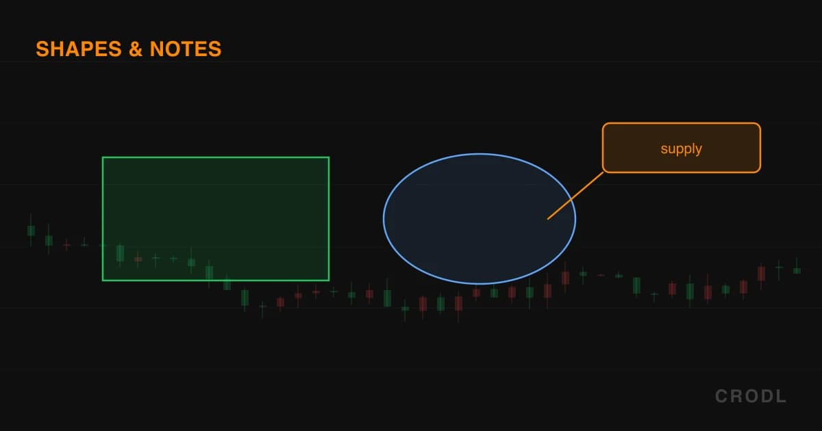
Shapes & Annotations: Turning Your Chart Into a Research Journal
Rectangles, ellipses and triangles mark the zones you will trade against later. Text, callouts, price labels and arrow marks leave notes for your future self.
Indicators tell you what the market is doing right now. Drawings tell you what you decided, and when. A rectangle over last Tuesday's rejection block is not decoration — it is a standing instruction to yourself: if price comes back here, I already know what I think.
Hold that split in your head. Shapes define zones you will trade against later; annotations are messages to the version of you who opens this symbol in three weeks having forgotten everything. Both live on the drawing toolbar down the left edge of the Crodl chart — shapes in the Shapes flyout, the rest in Annotate — and both restore with your layout.
Zone shapes: the boxes you trade against later
All three shape tools render the same way: a tone-tinted translucent fill inside a stroked outline, brightening slightly when selected. Deliberately faint — a zone should sit under the candles, not over them.
Rectangle (Alt+B)
Two clicks — opposite corners — and you have a box. This is the workhorse: supply and demand zones, consolidation ranges, the body of a fair value gap, a session's high and low. It defaults to a green outline at 1.4px, solid.
The handles sit exactly where you clicked, so dragging one stretches the box around the opposite anchor — the corner you are not touching stays nailed down. Drag the body and both anchors move together, which is how you slide a zone up to a higher retest without redrawing it.
Select a rectangle and it reports its own dimensions: a price pill at each corner anchor, plus a midpoint pill showing the box height as a price range, prefixed with a ↕. That last one answers whether a demand zone is 40 dollars deep or 400.
Ellipse
Two clicks again, and the anchors are opposite corners of the ellipse's bounding box — the oval is inscribed inside it. Same fill and outline treatment, same green default, same corner handles, same readouts when selected: a price pill at each anchor and a ↕ range pill in the centre.
Rectangles say "this level, this band." Ellipses say "roughly here, this cluster" — a liquidity sweep, a failed breakout, chop you want circled rather than bounded. The softer shape carries the softer claim.
Triangle
Three clicks, one per vertex, anywhere you like — not a right triangle or an equilateral one, just three arbitrary points with a filled, closed perimeter between them. Orange at 1.6px by default. Before the third click the preview collapses to a segment tracking your cursor, so you see the base before committing the apex.
Each vertex reshapes independently and all three edges are grabbable, so you can select the shape by its outline. Wedges, converging triangles, a pennant over a squeeze — anything where a rectangle would lie about the geometry.
Annotations: notes to your future self
Text (Alt+N)
One click opens an inline text field right where you clicked, focused and waiting, with an "Enter label…" placeholder and a 100-character cap. Enter commits, Escape discards, and clicking away commits what you typed. Type nothing and no drawing is created, so a stray click costs you nothing.
The result is a rounded chip: dark translucent background, border and lettering in the drawing colour (near-white by default), at 12px. Select it and the context bar's settings popover gives two text-specific fields — Label, which rewrites the words, and Size, accepting 10 to 32. You are never stuck with the first thing you typed.
This is the tool that turns a chart into a journal. "Failed here twice — third tap I'm out." "Missed this, waiting for a retest that never came." Nobody else will read them, and that is the point.
Callout
Two clicks. The first is the thing you are pointing at — the tip. The second places a rounded bubble centred on that point. A leader line runs from the tip to whichever bubble edge faces it, re-attaching as you drag either anchor so it never stabs through the bubble.
A callout starts life carrying the placeholder word "Callout", because the inline editor that pops up mid-placement is wired to the Text tool. To write yours, select the callout and use the Label field in the context bar — the same field the Text tool uses, with Size beside it.
Price label
One click drops a small rounded pill at that exact point, with a notch aimed at it, reading out the price you clicked. Precision scales with the instrument: two decimals above 100, four above 1, then six, eight or ten as price gets smaller, so a micro-priced token gets a readable number instead of 0.00.
It is a stamp, not a live level — exactly what you want for the number a wick reached, an old high worth remembering, or the fill you actually got.
Arrow marks (up and down)
One click each, no text. Arrow mark up draws a filled 14px triangle pointing up, sitting just below the anchor, teal by default. Arrow mark down is the mirror: pointing down, just above the anchor, red. The offset keeps the marker clear of the candle you are tagging. Reviewing a session, walk the bars and stamp every entry, every miss, every signal that fired.
Styling, locking and keeping the chart usable
Every drawing here selects into the same context bar: colour, line style (solid, dashed, dotted), width, a Visible checkbox that hides a drawing without deleting it, a lock toggle that keeps it rendered but frozen against accidental drags, plus duplicate, copy/paste and delete. A Labels toggle kills the shape pills when you want the zone without the numbers. For precision, magnet mode (M) snaps new anchors to candle OHLC values; holding Ctrl or Cmd while drawing inverts it.
Honest limitations
The most common failure is not a bug, it is you. Every shape fills at low opacity, and low opacity compounds — a chart with fifteen overlapping boxes becomes a grey wash where nothing reads as significant because everything does. Zones you would no longer trade should be deleted, not left as archaeology.
The callout's missing text entry is the real functional gap: it points, it does not narrate. The ellipse's clickable area is its bounding box, not the oval, so clicking an apparently empty corner can select it. The triangle has no price readout at all. And while you are panning or zooming, text chips and callout bubbles drop out of the render, snapping back the moment you release.
Finally, a hand-drawn box is your opinion — it is very easy to place a demand zone where you want support to be. For zones defined mechanically, Order Blocks, Range Boxes and Liquidity Zones draw theirs from rules that do not care what you are positioned in.
Frequently Asked Questions
Do my shapes and notes survive a refresh?
Yes. Drawings save and restore with your layout, so the markup is waiting when you reopen the symbol — the whole premise of using them as a journal rather than scratch marks.
Can I type my own text into a callout?
Yes. It arrives holding the placeholder word "Callout" — the editor that appears while you are placing a drawing belongs to the Text tool — but select the callout and the context bar gives you the same Label and Size fields the Text tool uses. Type there and the bubble re-renders around your words.
How do I get a box's edges exactly on the wick or the body?
Turn on magnet mode with M — new anchors snap to candle OHLC values, so a zone sits precisely on a high, low, open or close. If the box is already placed, drag a corner handle: it stretches around the opposite anchor, leaving the edge you already had right untouched.
Rectangle or ellipse for a supply zone?
Rectangle, almost always. A supply zone has hard edges — a price above which you are wrong — and the rectangle's pills report those edges and the zone's height. Save the ellipse for genuinely fuzzy things.
Mark it once, trade it later
Open the Crodl terminal, press Alt+B and box the last place price rejected. Press Alt+N and write down why. In three weeks, when price is back at that level and you have forgotten every detail of today, the chart will remind you — and most trading journals break precisely because they live somewhere other than the chart.
This article is for educational purposes only and is not financial advice. Leveraged trading carries substantial risk of loss. Always do your own research and never risk more than you can afford to lose.

Ready to automate your trading?
Connect your exchange, set up automations, and start trading smarter — all from one platform.
Start Trading Free