
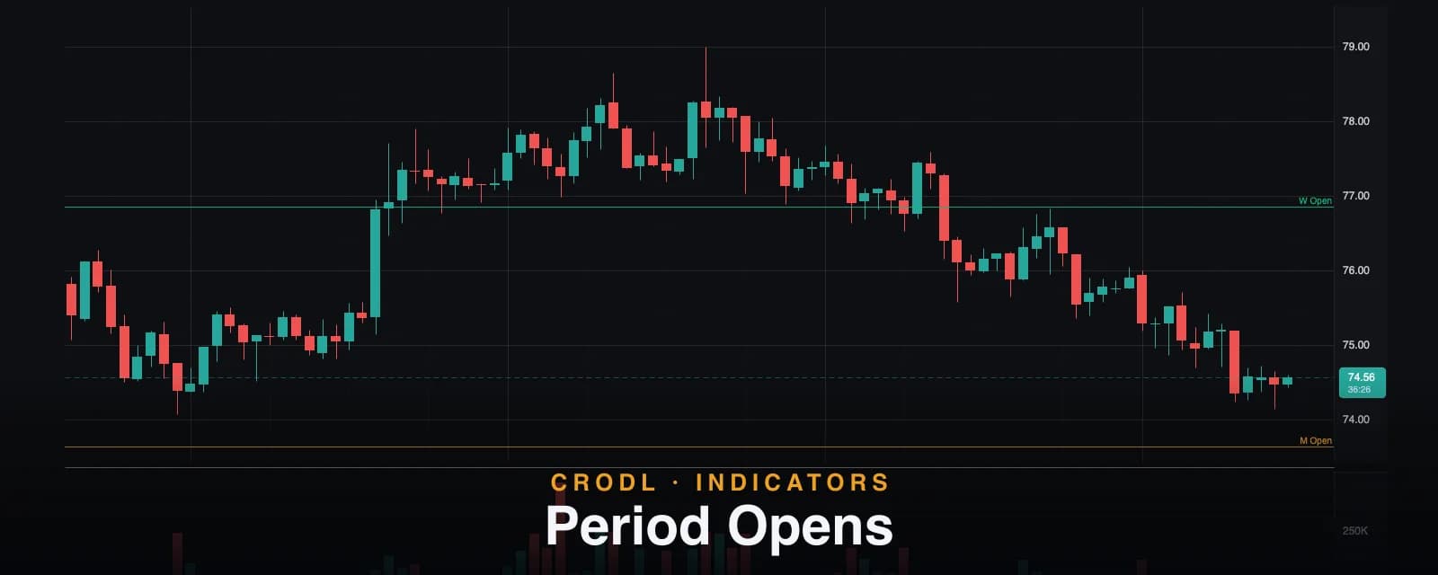
Period Opens: Weekly, Monthly, Quarterly and Yearly Open Lines
Weekly, monthly, quarterly and yearly open lines in pure UTC — how each period is bucketed, what the dashed ≈ levels mean, and how traders frame bias around the opens.
Ask a discretionary trader where price is "really" trading and the answer is usually relative to an open: above the weekly open, the week belongs to the bulls; below the monthly open, every rally is suspect until reclaimed. The open of a period is the auction's reference price — the level where longs and shorts entered the period even, and the level algorithms, funds, and ICT-style traders alike keep measuring against until the period ends.
Period Opens on the Crodl terminal draws that reference frame as dedicated horizontal lines: the current weekly and monthly opens by default, with quarterly and yearly tiers and previous-period opens available as opt-ins. Each tier gets its own color and a right-edge label, and — the part most open-line indicators quietly fudge — every level that cannot be computed exactly from your loaded history says so on the chart instead of pretending.
What it draws
- Weekly open (teal) and Monthly open (amber) — on by default, labeled
W OpenandM Openat the right edge. - Quarterly open (slate,
Q Open) and Yearly open (orange,Y Open) — off by default, one toggle each. - Previous period opens (off by default) — the prior week's/month's/quarter's/year's opens, drawn dimmer across the full visible width and labeled with a
pprefix (pW Open,pM Open, ...).
Current-period lines start at the period's first loaded bar and extend to the right edge, so you can see exactly where the period began. When several opens land at nearly the same price — common right after a new month opens a new week — the labels automatically nudge apart vertically so they stay readable.
How periods are bucketed
Everything is computed in pure UTC from candle open times — a bar belongs to the period its open falls inside, the same convention as Session Levels, so the two studies never disagree about where a week starts on the same chart.
| Tier | Period starts | Label | Default |
|---|---|---|---|
| Week | Monday 00:00 UTC (ISO week) | W Open | On |
| Month | 1st of the month, 00:00 UTC | M Open | On |
| Quarter | Jan / Apr / Jul / Oct 1, 00:00 UTC | Q Open | Off |
| Year | Jan 1, 00:00 UTC | Y Open | Off |
The Monday-start ISO week is the crypto convention — it matches how most exchanges and data providers cut weekly candles — and the month, quarter, and year tiers are plain UTC calendar boundaries, immune to daylight-saving shenanigans by construction.
The dashed ≈ levels — honesty about missing history
Here is the problem every open-line indicator has and few admit: if your chart's loaded history starts in the middle of a period, the true open of that period is simply not on your chart. A 15-minute chart usually holds a few weeks of candles — the bar that opened the year is thousands of bars behind the left edge. An indicator that silently draws "the yearly open" from whatever bar happens to be loaded first is showing you a wrong number with a confident face.
Period Opens gates this explicitly. When a period's first loaded bar is not the period's true first bar — history starts mid-period, or the exact boundary bar is missing from the feed — the level still draws (the first loaded bar's open is the best available estimate), but it renders dashed and its label gains a " ≈" suffix. Solid line: this is the true period open. Dashed with ≈: this is an approximation from partial history.
The detection carries a one-bar tolerance so coarse charts stay fair: on a weekly chart, the first bar of a month can legitimately open several days after the 1st and still be that chart's true month open — it is not flagged. Scroll further back (loading more history) and an approximate level firms up into a solid one as soon as the true boundary bar arrives.
How traders use it
Bias framing: which side of the open
The simplest and most durable use: above the weekly open, favor longs for the week; below it, favor shorts — and demand extra evidence before fighting that read. Stacking tiers sharpens it: price above the monthly and weekly open is aligned; price above the weekly but below the monthly open is a week-long rally still inside a bearish month.
Open retests as entries
Openings get retested. A common playbook: the week opens, price extends away, then returns to the weekly open — and how it behaves there sets the tone for the rest of the week. A clean bounce is continuation; a flat acceptance through it flips the bias. The same logic scales up to monthly and quarterly opens with proportionally more weight.
Quarterly and yearly opens as macro magnets
Quarter and year opens are where longer-horizon flows are benchmarked — "up on the year" literally means above the yearly open. They act as magnets and battlegrounds during macro repricings, and having them pinned on an intraday chart keeps the big frame visible while you trade the small one. For full higher-timeframe candles rather than just their opens, the HTF Candles overlay is the natural companion.
Settings that matter
- Weekly open (default on) / Monthly open (default on) — the core pair.
- Quarterly open (default off) / Yearly open (default off) — the macro tiers.
- Previous period opens (default off) — adds the
p-prefixed prior-period levels, dimmed. - Weekly / Monthly / Quarterly / Yearly colors — teal, amber, slate, and orange by default, so tiers are distinguishable at a glance.
An honest note on approximations
Three limitations worth knowing. First, the ≈ gate is honest but not magic: an approximate yearly open on a 15-minute chart can be far from the true one — treat dashed levels as orientation, not precise triggers, or load more history. Second, "previous period" means the last period seen in your loaded data — across a data gap it may not be the immediately adjacent one. Third, everything is UTC by convention; if you frame your weeks around a different session anchor, these levels will not match your mental model, and no setting changes the timezone.
Frequently Asked Questions
Why is my yearly open dashed with a ≈?
Because the bar that actually opened the year is not in your loaded history — on low timeframes it almost never is. The indicator draws the first loaded bar's open as an estimate and marks it approximate rather than presenting it as exact. Scroll back to load more history and it will solidify once the true boundary bar loads.
When exactly does the week start?
Monday 00:00 UTC — the ISO week convention used across crypto. Months, quarters, and years start at 00:00 UTC on their calendar boundary. A bar belongs to the period of its open time.
How is this different from Session Levels?
Session Levels is the day-trading level set — previous day/week highs and lows plus compact day/week/month open tags. Period Opens is the dedicated open-line study: per-tier colors and toggles, the quarterly and yearly tiers, previous-period opens, and the explicit true-open vs approximate-open gate. Many traders run Session Levels intraday and add Period Opens when the higher-tier opens matter.
Do the lines repaint?
No. A period's open is fixed the moment its first bar closes its first tick — the line simply extends rightward as bars print, and it rolls to a new level only when the calendar rolls the period. The only visual change to an existing level is an approximate (≈) open firming into an exact one when you load deeper history — which is a correction toward truth, disclosed by the dashing.
Anchor your bias
Period Opens is live on every Crodl terminal chart — add it from the indicator picker and keep the weekly, monthly, quarterly, and yearly reference frame pinned to every trade you take.
This article is for educational purposes only and is not financial advice. Leveraged trading carries substantial risk of loss. Always do your own research and never risk more than you can afford to lose.

Ready to automate your trading?
Connect your exchange, set up automations, and start trading smarter — all from one platform.
Start Trading Free