
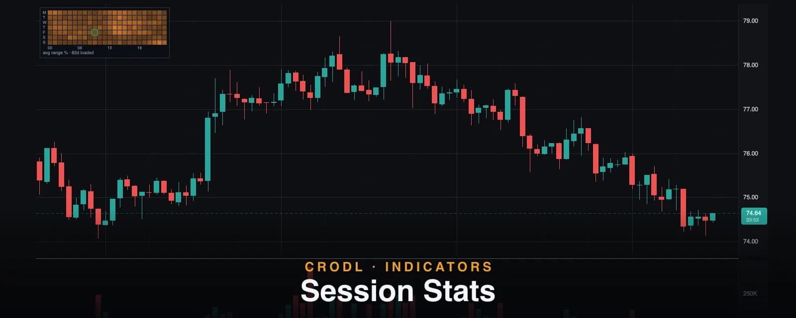
Session Stats: A Heatmap of When Your Market Actually Moves
A volatility heatmap by UTC hour and weekday, built from the candles on your chart — how the buckets are averaged, what hollow cells mean, and how to pick your hours.
Crypto trades 24/7, but it does not move 24/7. Volatility clusters into a handful of hours each day — the London open, the New York overlap, the odd Asian-session burst — and the rest of the clock is mostly chop that costs spread and patience. Session-window indicators like ICT Killzones assert those windows from convention. The obvious follow-up question is empirical: for this symbol, on this chart, which hours actually move?
Session Stats on the Crodl terminal answers it from the data already in front of you. It buckets every loaded candle by UTC hour-of-day and day-of-week, averages each bucket's volatility, and pins the result to the chart as a compact heatmap panel — a 24-cell hour strip by default, or a full 7×24 week grid — with your current hour outlined so you always know where "now" sits in the market's weekly rhythm. No external data, no survey of someone else's market: your chart's own history, summarized.
How the stats are built
Every closed candle on the chart is assigned to a bucket by the UTC weekday (Monday–Sunday) and UTC hour (0–23) of its open time. For each bucket the indicator tracks two things:
- the mean of (high − low) / close — relative range, so a bucket averaged across different price regimes stays comparable (a $500 range at $25k and a $1,000 range at $50k are the same 2%);
- the sample count — how many bars actually fed that mean.
The forming bar is excluded — only completed candles count — and per-hour marginals (all weekdays combined) are derived for the compact strip view. Cell brightness is normalized to the hottest qualified bucket, so the tint always reads as relative heat: the brightest cell is this market's most volatile hour in the loaded data, and everything else scales against it.
The two views
- Hour strip (default) — a single horizontal row of 24 cells, one per UTC hour, with 00/06/12/18 tick labels underneath. The fastest possible answer to "which hours move?"
- Full week grid — the complete 7×24 heatmap, rows Monday through Sunday. This is where weekly structure appears: weekday London hours glowing while the same hours on Saturday sit dark.
Both views live on a translucent dark slab pinned to a chart corner (bottom-left by default) so the panel reads clearly over candles, and both outline the current cell in teal. That highlight follows the chart's clock — the open time of the newest bar — not your wall clock, which means it does the right thing during bar replay: replay a Tuesday from last month and the highlight tracks the replayed Tuesday hour.
| Cell appearance | What it means |
|---|---|
| Bright filled cell | High average range — this hour moves, relative to the market's best |
| Faint filled cell | Qualified data, low average range — historically quiet |
| Hollow (outline-only) cell | Fewer than the minimum samples — not enough data for a confident tint |
| Faintest hollow cell | Zero samples in loaded history |
| Teal outlined cell | The current hour (by the chart's clock) |
Honesty built in
Three rules keep the panel from lying to you:
- Low-sample cells render hollow. A bucket with fewer than Min samples per cell bars (default 8) draws as a dim outline instead of a confident fill — insufficient data is displayed as insufficient, never disguised as a real reading. The brightness normalization likewise prefers qualified buckets, so one lucky 2-bar cell cannot compress the scale for everything else.
- The legend discloses the sample. The one-line legend —
avg range % · 34d loaded— tells you exactly how many distinct UTC days of history fed the stats. Fourteen days is a sketch; sixty is a portrait. - The panel refuses to render where the math breaks. On timeframes above 1h it draws nothing: a 4h bar spans four hour-cells but would be credited entirely to its opening hour, fabricating the very stats the panel exists to report. The same suppression applies on volume and renko chart types, where a bucket's open time does not bound the real time span the bar covers.
How traders use it
Pick your hours
The most direct use: look at the strip once and stop giving equal attention to all 24 hours. If 13:00–17:00 UTC carries triple the average range of 02:00–06:00 on your pair, your setups during the hot window deserve full size and attention, and the dead window is where overtrading goes to die.
Verify the killzones for your symbol
The killzone windows are conventions inherited from forex. Session Stats is the audit: overlay both, and check whether your market actually concentrates its range inside the boxes you are trading. Majors usually agree; smaller alts can surprise you — some move on Asian hours, some barely respect sessions at all.
Respect the weekly structure
Flip to the full week grid before sizing a weekend position. Saturdays and Sundays are visibly cooler on most pairs — thinner books, smaller ranges, and the occasional low-liquidity spike the averages smooth over. An hour's typical range also pairs naturally with an ATR read when deciding whether a stop that fit Tuesday's London open still fits a Sunday morning.
Settings that matter
- View (default Hour strip) —
Hour stripfor the 24-cell marginals,Full week gridfor the 7×24 heatmap. - Min samples per cell (default 8) — the confidence threshold below which a cell renders hollow. Raise it for stricter stats, lower it when working with short histories.
- Panel corner (default Bottom left) — pin the slab to any of the four chart corners.
- Heat color (brand orange) and Current hour highlight color (teal), plus Opacity (default 100).
An honest note on averages
Session Stats is history, not prophecy. The heatmap describes how the loaded candles moved on average; a news event at 03:00 UTC does not care that the cell was dark. The stats also come only from candles you have loaded — scroll back to feed the grid (the full week view needs several weeks of intraday data before most cells qualify), and read the legend's day count before trusting a pattern. Hours are UTC, so translate to your local time when planning your day. And the tint is normalized to this chart's own hottest bucket: it tells you when this market moves, not whether it moves more than another market.
Frequently Asked Questions
Why is the panel not showing at all?
Four possibilities: the timeframe is above 1h (hour-level stats cannot be computed honestly from multi-hour bars), the chart type is volume or renko (bucket time spans are not real clock hours), too few candles are loaded, or the pane is too small for a legible panel — it skips rendering rather than draw unreadable cells.
Why are some cells just outlines?
Those buckets have fewer than the Min samples per cell threshold (default 8) in loaded history. The indicator shows them hollow instead of tinting them, because a mean of three bars is noise wearing a costume. Load more history or lower the threshold.
Is the highlighted cell my local time?
No — it is the current UTC hour by the chart's clock, taken from the newest bar's open time. That makes it replay-friendly (it highlights the replayed hour during bar replay), but it means you should mentally convert to your timezone when reading the strip.
How much history do I need?
The legend tells you: avg range % · Nd loaded. For the hour strip, a couple of weeks of 15m–1h candles already qualifies most cells at the default threshold. For the full week grid — where each cell only collects samples one weekday per week — expect to need roughly two months before the picture fills in.
Trade when your market trades
Session Stats is live on every Crodl terminal chart — add it from the indicator picker and let your own chart tell you which hours are worth your attention.
This article is for educational purposes only and is not financial advice. Leveraged trading carries substantial risk of loss. Always do your own research and never risk more than you can afford to lose.

Ready to automate your trading?
Connect your exchange, set up automations, and start trading smarter — all from one platform.
Start Trading Free