
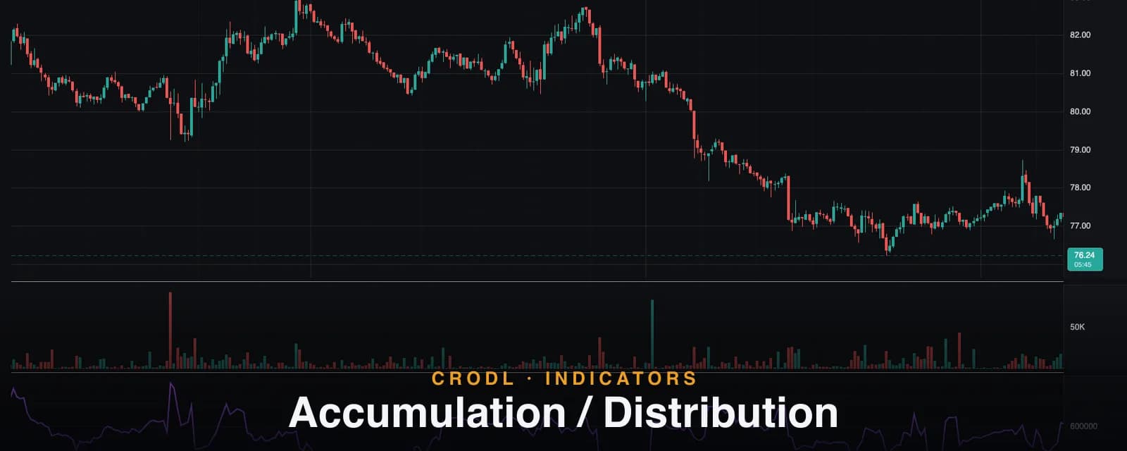
Accumulation / Distribution
The A/D line tracks cumulative money flow by weighting volume with each bar's close location. How Crodl's parameter-free preset works and how to read divergences.
Markets top when smart money sells into strength and bottom when it buys into weakness — and both happen while price is still telling the opposite story. The candles look fine at a distributing top; they look terrible at an accumulating bottom. What gives the game away is not price. It is where each bar closes within its range, and how much volume trades while it does.
That is precisely what Marc Chaikin's Accumulation/Distribution line (A/D) tracks. Every bar earns a score from −1 to +1 based on where it closed between its low and high, that score is multiplied by the bar's volume, and the results accumulate into a single running line. When the line rises, volume is systematically landing on bars that close strong — accumulation. When it falls, volume is landing on weak closes — distribution.
The Accumulation/Distribution preset on the Crodl terminal implements the classic calculation with zero configuration required. This post covers how the line is built, how to read it (and how not to), and the divergence patterns that made it famous.
What the A/D line measures
The engine of the indicator is the money flow multiplier, sometimes called the close location value:
multiplier = ((close − low) − (high − close)) / (high − low)
It compares the distance from the low up to the close against the distance from the close up to the high. Close at the very top of the bar and the multiplier is +1 — buyers held every gain. Close at the very bottom and it is −1. Close mid-range and it is 0, no matter how green or red the candle looked.
Multiply by the bar's volume to get money flow volume, then keep a cumulative total:
| Close location | Multiplier | Contribution to A/D |
|---|---|---|
| At the high | +1.0 | Full bar volume added |
| Upper half | 0 to +1 | Partial volume added |
| Dead center | 0 | Nothing |
| Lower half | 0 to −1 | Partial volume subtracted |
| At the low | −1.0 | Full bar volume subtracted |
The subtlety worth appreciating: a green candle can subtract from the A/D line. If price gaps up, rallies, then gets sold to close in the lower half of its range, the bar closed above yesterday but below its own midpoint — the multiplier is negative, and the A/D records distribution. Close-to-close tools like OBV would count that same bar as pure buying.
How it works on the Crodl terminal
Crodl's Accumulation/Distribution preset is deliberately parameter-free — the only setting is the line color (purple by default). There is no length, no smoothing, no threshold: the classic formula has none, and the preset stays faithful to it. Each bar's money flow volume is computed, zero-range bars (high equals low) contribute nothing rather than a division error, and the cumulative sum is drawn as a 2px line in its own pane with a live last-value label.
One consequence of the cumulative design matters for reading it: the line starts summing from the beginning of your loaded chart history. Load more history and every value shifts by a constant offset. That is expected — the absolute A/D value carries no information. Only the slope, the swing structure of the line itself, and its agreement or disagreement with price mean anything. Compare the line to its own recent highs and lows, never to a number on another chart or platform.
What volume adds over price-only oscillators
A price-only oscillator — RSI, stochastic, and family — is arithmetic on the close series. It can tell you price momentum is fading, but it cannot tell you whether anyone traded that fade. The A/D line brings two independent inputs: volume, and intrabar close location.
That combination detects the specific behavior price hides. Distribution does not look like falling prices — it looks like rising prices with weak closes on heavy volume, as size sells into the bid without breaking the trend. On the candles that is nearly invisible. On the A/D line it is unmistakable: price makes a new high, the line does not. The volume component means the divergence is being driven by real money, not by a formula recycling the same price data — which is why A/D divergences are treated as evidence of positioning rather than merely fading momentum.
How traders use it in crypto
Divergence at highs and lows
The signature signal. Price prints a marginal new high; the A/D line prints a lower high — volume-weighted conviction has already left the trend. The mirror at lows (price lower low, A/D flat or rising) marks accumulation into weakness, the pattern that precedes many durable crypto bottoms. Divergences on 4h and daily charts, built over weeks, carry far more weight than intraday ones — see our divergence guide for structuring these setups with confluence.
Trend confirmation
In a healthy trend, the A/D line makes new highs with price, or before it. Many trend-followers use that agreement as a hold condition: stay long while both price and A/D keep printing higher highs, and treat the first failure of the A/D line as an early warning that precedes the price break.
Range resolution
Inside a consolidation, price is sideways by definition — but the A/D line rarely is. A flat range with a steadily rising A/D line is being quietly accumulated, and the eventual break is far more likely to resolve upward. The line effectively lets you watch the range's order flow without order-flow data.
Timing with the Chaikin Oscillator
The raw A/D line is a slow, cumulative curve — good for direction, poor for timing. The Chaikin Oscillator exists to fix exactly that: it takes fast and slow EMAs of this same A/D line and oscillates around zero, turning the line's momentum shifts into crossable signals. A/D for the story, Chaikin Oscillator for the trigger is the intended pairing.
Frequently Asked Questions
A/D vs OBV — which is better?
They answer slightly different questions. OBV votes each bar's entire volume by close-to-close direction — blunt but fast. A/D weights volume by close location within the bar — finer-grained, and able to detect distribution hidden inside green candles. Neither dominates; when both diverge from price together, the signal is strongest.
Why is my A/D value different from another platform?
Because the line is cumulative from the start of loaded data, and every platform (and chart depth) loads a different amount of history. The shapes will match; the levels will not. This is cosmetic — only slope and structure matter.
What are the A/D line's blind spots?
Gaps. The multiplier only sees the bar's own high–low range, so a coin that gaps down 8% but closes mid-range on the day registers a neutral-to-positive bar despite the loss. Windowed relatives like Chaikin Money Flow inherit the same trait. In 24/7 crypto markets true gaps are rare, which is partly why the Chaikin family works better here than in equities.
Why are there no settings?
The classic formula has no parameters — it is a pure accumulation. If you want a windowed or smoothed variant, that is exactly what CMF (windowed average) and the Chaikin Oscillator (EMA spread) are.
Watch what money does, not what price says
The Accumulation/Distribution line is available on every Crodl terminal chart — add it from the indicator picker and see whether volume is quietly accumulating or distributing beneath the candles, alongside live trading on six exchanges.
This article is for educational purposes only and is not financial advice. Leveraged trading carries substantial risk of loss. Always do your own research and never risk more than you can afford to lose.

Ready to automate your trading?
Connect your exchange, set up automations, and start trading smarter — all from one platform.
Start Trading Free