Volume Profile Drawing Tools: Fixed Range and Anchored
Crodl's two volume-profile drawings — a fixed range you place between two candles, and an anchored profile that runs from one candle to the live bar — with POC, value area and a buy/sell split.
A candlestick chart answers when. Every bar is a slice of time, and the histogram beneath it says how much traded during that slice. What it never says is the thing that decides most levels: at which prices the business actually got done.
A volume profile rotates the question ninety degrees — volume per unit of price instead of per unit of time. The long rows are the prices the market spent real money at; the short ones it passed through on the way somewhere else. Crodl ships two as drawing tools, because the useful version of this question is always scoped to a stretch of chart you picked. Both live in the Volume flyout on the toolbar covered in the drawing tools guide, under the Volume-based heading.
What a profile is telling you
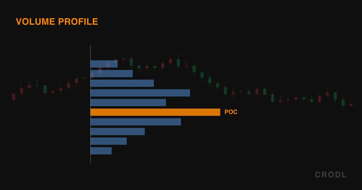
The POC — point of control — is the price row with the most volume in it. It is where the most business was done, the closest thing a range has to a consensus price. Price tends to return to it, and when it does the market has to decide again whether that consensus holds.
The value area is the band around the POC holding the bulk of the volume — 70% by default. Inside it the market agreed; outside, it was rejected. The edges (VAH above, VAL below) are where agreement stopped, which is why they behave like support and resistance without anyone drawing a line there.
High-volume rows act as magnets, low-volume rows as fast-travel zones. Price returning to a thick row finds activity and hesitation; a thin row is a price nobody wanted, so price crosses it quickly. The gaps in a profile are where moves accelerate.
The two tools
Fixed Range Volume Profile
Two clicks: the first sets the start candle, the second the end, and the profile covers that candle range inclusive. It is the tool for a defined event — a consolidation, a trading day, a leg from swing low to swing high.
The clicks carry only their candle, not their price: the vertical extent is always the lowest low to the highest high of the bars in range, so it makes no difference whether you clicked the top or bottom of a bar. Dragging follows the same rule — the body slides sideways and ignores vertical movement entirely, and two handles move the start and end candles independently. One quirk: the right edge is capped at the newest candle, so an end anchor dropped ahead of price behaves like the anchored tool until price catches up, then locks.
Anchored Volume Profile
One click. That click is the left edge, and the right edge is always the newest available candle — or the replay cursor, if you are replaying. The profile grows: as candles print, the rows, POC and value area recompute live rather than sitting frozen at the moment you placed it.
That makes it the tool for a since question: since the breakout, where has volume built, and is the POC climbing — acceptance higher — or stuck at the lows? It is the distribution counterpart to Anchored VWAP, which answers the same question with one average price rather than a shape.
Both tools are locked to the price pane and neither has a keyboard shortcut. The Volume group button activates the fixed range tool; the caret beside it opens the flyout.
How the profile is built
The price span of the range — lowest low to highest high — is cut into equal-height rows, 48 by default, adjustable from 8 to 120. Each candle hands its volume to the rows its high-to-low range overlaps, split proportionally to how much of the candle's range falls in each row. Up and down volume is separated by candle direction, a close at or above the open counting as up.
The POC is the row with the most total volume. The value area grows outward from it: starting at the POC row, the tool repeatedly absorbs whichever neighbouring row carries more volume until the absorbed rows cover the target share of total volume, ties broken upward. The target is 70% by default, adjustable from 30 to 95. VAH is the top of the highest included row, VAL the bottom of the lowest.
Ranges over 4,096 bars are sampled rather than walked bar by bar — one representative candle per equal-width chunk, its volume scaled by that chunk's bar count, with the endpoints always included.
What you see on the chart
The histogram is right-aligned: every row's bar starts at the right edge of the range and grows leftward, scaled so the heaviest row is full width. Full width is the Width % setting — 35% of the range's own on-screen span by default — so a wide range gets a proportionally wide histogram. Brightness carries the hierarchy: POC row most opaque, value-area rows in the middle, everything outside faded. With the buy/sell split on, each bar is two segments — down volume in red on the outer end, up volume in green hugging the right edge; turn it off and rows draw as one bar in the drawing's colour.
A faint tint fills the value-area band across the range, VAH and VAL draw as fine dashed lines, the POC gets a heavier dashed one, and dashed vertical rails mark both ends — which is how you see where an anchored profile's live edge sits. Price labels (POC, VAH, VAL) appear when the drawing is selected, off the right end of the range, and are suppressed while you pan or zoom.
Settings
Select a profile and the context bar gains six controls of its own, on top of the colour, line style, width, labels, lock and hide controls every drawing has:
| Setting | Range | Default |
|---|---|---|
| Rows | 8–120 | 48 |
| Value area % | 30–95 | 70 |
| Width % | 10–100 | 35 |
| POC | on / off | on |
| Value area | on / off | on |
| Buy / sell split | on / off | on |
Rows is the one that changes the answer rather than the look: fewer rows gives a POC that describes a zone, more rows a POC that can sit on a single thin price.
Honest limitations
The shape is a function of the range you chose. Move the start anchor twenty bars earlier and the POC can jump to a different price, because you added a different chunk of trading to the sample. A profile is not an objective fact about the market; it is an answer to a question you framed by clicking. Nudge anchors until the POC lands on a level you already liked and you are reading your own conclusion back to yourself.
It is built from candles, not from trades. Volume is spread across each candle's high-low range in proportion to overlap — the standard approximation when tick data is not available — so it smears across prices where little actually traded. Treat the POC as a neighbourhood, not a tick.
The green/red split is candle direction, not aggressor side. A candle closing above its open counts as up volume in full. It is not buy-versus-sell order flow.
Crypto volume is exchange-local. The profile comes from the symbol on the exchange feed you are charting. The same pair elsewhere produces a different profile, and no single venue's volume is the market's.
Nothing is stored on the drawing. The profile is recomputed from candles every time, so one anchored before your chart's loaded history cannot render until that history arrives.
Frequently Asked Questions
How are these different from the Volume Profile (VPVR) indicator?
Scope. The VPVR indicator profiles whatever is currently visible and recomputes as you pan and zoom, so its POC moves when your viewport moves. These drawings are pinned to candles you chose. Survey with VPVR, commit with a drawing. For a profile per candle or per session, see Periodic Volume Profile; for the time-based cousin, the TPO Profile.
Does the anchored profile keep updating as new candles print?
Yes — its right edge is always the newest candle, so the histogram, POC, VAH and VAL recompute as live data arrives. In replay it follows the replay cursor instead. The fixed range tool is static once both anchors sit on existing candles.
Why does my POC move when I nudge an anchor?
The sample changed. The POC is the heaviest row of the bars you included, so adding or dropping a few high-volume bars at either end can shift it — especially at high row counts, where rows are thin. An unstable POC is real information: that range has no single dominant price, so read the value area as the level instead.
Should I change the value area from 70%?
Usually not. 70% is what almost every profile trader and every other profile tool uses, so your levels agree with everyone else's. Widening to 85–90% shows the extremes of acceptance; narrowing to 50% gives a tight core-value band.
Draw the range, then read the level
Both tools are in the Volume flyout on any Crodl terminal chart. Draw one over the range price is sitting in now, find the POC, and watch how often the next reaction happens exactly there.
This article is for educational purposes only and is not financial advice. Leveraged trading carries substantial risk of loss. Always do your own research and never risk more than you can afford to lose.

Ready to automate your trading?
Connect your exchange, set up automations, and start trading smarter — all from one platform.
Start Trading Free