Measurement Tools: Price Range, Date Range and Premium/Discount
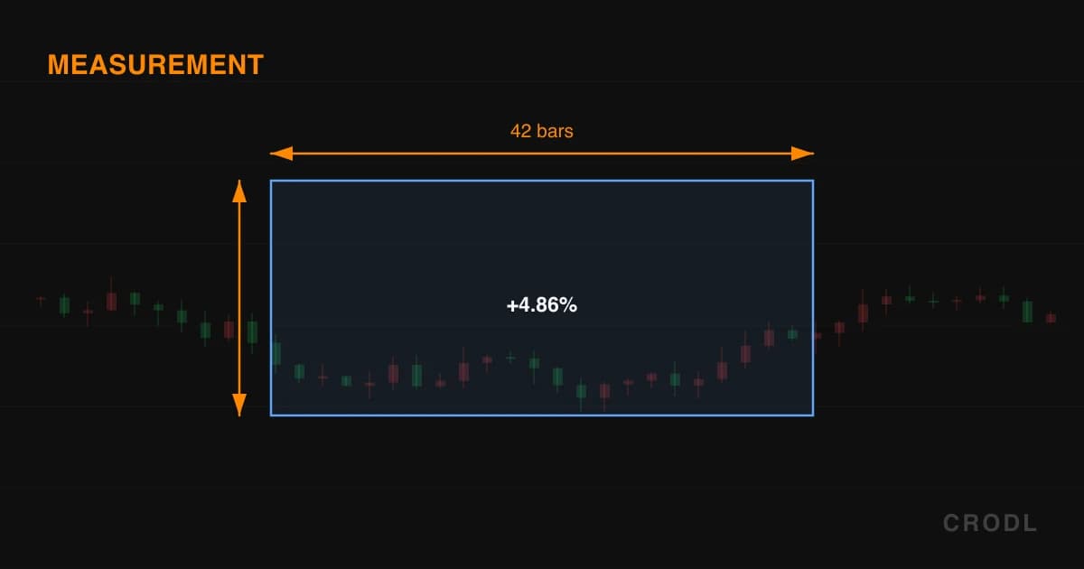
The four Measure tools on the Crodl chart: price range with delta and percent, date range in bars and elapsed time, both at once, and premium/discount zones.
Most of the questions you ask a chart are questions of size. How far did that leg run? How long did the last consolidation take, and has this one run longer? Is the pullback deep enough to buy, or is price still in the expensive half of its range? "That looks like a big drop" is not a number you can size a trade with.
The Measure flyout on the Crodl drawing toolbar — the rail down the left edge of the chart — holds four tools that answer those questions with numbers. Two clicks each, no settings to configure, no shortcut to memorise.
The four tools
Price Range
Click twice, in any order. The tool draws a lightly tinted rectangle between the anchors, an arrowed vertical line through its centre pointing the way price travelled, and a solid pill placed outside the box — above for an up-move, below for a down-move — so it never covers the candles it describes. Two lines:
- The move: the absolute price difference between the anchors, signed, then the percentage change in parentheses to two decimals.
- The span: the bar count, as the difference between the anchors' candle indices.
The percentage is measured from the first anchor you placed — click the low first for the size of the rally off it, the high first for the drawdown from it.
When it matters: measured moves. Measure the impulse leg — flagpole, expansion candle, pattern height — then duplicate the drawing and drag the copy so its first anchor sits on the breakout point. The second anchor lands on the projected target: the arithmetic behind the targets in chart pattern detection, applied by hand. It doubles as a sizing check on entry-to-invalidation distance.
Date Range
The time-only sibling. Two clicks place vertical dashed markers spanning the full height of the price pane, a faint band between them, and a pill at the top. Price is deliberately ignored — both anchors resolve horizontally only, so the tool works even if you click into empty space above the candles. The pill reads:
- Bars: the difference between the anchors' candle indices.
- Duration: elapsed wall-clock time, formatted
2d 6hpast a day,6h 45mpast an hour,45m 30sbelow that.
Duration comes from the timestamps of the candles at each anchor, not from the anchors themselves, so it survives dragging the band sideways.
When it matters: cycles and rhythm. Consolidations in a given regime tend to last a characteristic number of bars, and so do the impulse legs between them. Measure the last three and you have an expectation for the current one — enough to judge whether a quiet market is still building or has overstayed. When the question is when rather than how long, reach for session levels or ICT killzones.
Date & Price Range
The union of the two, and the one most traders live in. Same tinted rectangle, plus two arrowed centre lines — vertical for the price span, horizontal for the time span — coloured by the direction of the move. One pill carries everything: signed price delta with its percentage on the first line, bar count and elapsed duration on the second.
When it matters: whenever velocity is part of the thesis. A 12% move in 9 bars and a 12% move in 400 bars are not the same event, and this card states both halves at once.
Premium/Discount
The odd one out: it does not measure a move, it frames a range. Anchor the clicks at the extremes of a dealing range — the swing high and swing low you consider current — and the tool splits it in half. It draws this and nothing more:
- Range boundaries — solid lines at the high and the low, in the drawing's colour.
- Equilibrium — a dashed mid-grey line at the 50% price midpoint, computed in price and projected through the pane's scale, so on a log chart it sits at the true price midpoint rather than the pixel middle of the box.
- Two zones — the upper half labelled PREMIUM (expensive, where you look to sell), the lower half DISCOUNT (cheap, where you look to buy), shaded in the theme's up and down tones.
- Prices at the right edge —
High,EQandLowwith their values.
No other fractions: no 61.8%, no 79%, no optimal-entry pocket.
Draw order encodes direction. Drag low to high and the range is tagged ▲ LONG with the discount half shaded more strongly, because the pullback you would be buying lands down there; drag high to low and it flips to ▼ SHORT with premium emphasised. Dragging a handle past the other anchor re-derives it live.
When it matters: when you want to know whether you are paying up. The smart-money framework is one rule — longs in discount, shorts in premium — and the same setup taken at 30% of a range and at 70% of it are two different bets. Anchor to a range you believe in: a confirmed swing high and low, or the leg behind the last break of structure.
What all four share
Two clicks to place, drag a handle to adjust, drag the body to slide the whole thing. Anchors round to the instrument's tick, and with magnet mode on (the magnet button, or M) they snap to the nearest OHLC of the candle under the cursor — hold Ctrl/Cmd to invert that for one interaction. Colour, width and line style are the standard drawing controls, and the settings popover's Labels checkbox hides the readout while keeping the geometry.
These are drawings, not indicators: they persist across reloads, re-attach by timestamp when you change timeframe, and never move on their own.
Honest limitations
The bar count is a difference between indices, not an inclusive count of candles: anchors ten bars apart read 10 bars while the box spans eleven. It is also timeframe-local; the duration is not. Duration rounds, too: past 24 hours it shows days and hours and drops minutes.
Percentages are asymmetric, because they are measured from the first anchor. A top-to-bottom drop reads −50%; the same span bottom-to-top reads +100%. Both are correct, but comparing measurements taken in opposite directions misleads you.
None of these tools report volume, project a target, or alert. Price Range measures the leg; moving the copy to the breakout point is still your judgement.
Premium/Discount is fully manual — no pivot confirmation, no re-anchoring when the range breaks, no opinion about whether the range you drew is the one the market is trading. That is the trade-off against the Premium & Discount indicator, which anchors to confirmed swings, re-anchors only on confirmation, and draws the OTE pocket the drawing omits. Use the drawing for a range the automation would not pick; the indicator to have the current one maintained.
Frequently Asked Questions
Should I use Price Range or Date & Price Range?
Use Date & Price Range unless you have a reason not to — same two clicks, and it reports elapsed time as well. Price Range is the cleaner card when time is irrelevant, such as stop distance.
Does the percentage measure from the low, or from where I clicked first?
From where you clicked first — the first anchor is always the base of the calculation.
Why does my bar count change when I switch timeframes?
Bars are counted in candles of the timeframe on screen: a 12-hour span is 12 bars on the 1h and 144 on the 5m. Duration comes from candle timestamps, so it does not change.
How is the Premium/Discount tool different from the indicator with the same name?
The drawing puts the range where you put it and leaves it there. The indicator finds the dealing range itself from confirmed swing pivots, re-anchors on confirmation, adds an equilibrium band and an optional OTE zone, and updates without you.
Put a number on it
The Measure flyout is on every Crodl terminal chart. Next time a move looks big, measure it — then measure the last three like it, and find out whether it was.
This article is for educational purposes only and is not financial advice. Leveraged trading carries substantial risk of loss. Always do your own research and never risk more than you can afford to lose.

Ready to automate your trading?
Connect your exchange, set up automations, and start trading smarter — all from one platform.
Start Trading Free